Topics: tattoo stencils, dark skin colors, contour lines, tattoos on dark skin, tattoo stencils on dark skin, stencil tips, tattoo tips
In this article, “Become a Master Tattooer in 3 Minutes,” we share Jake’s outlines and strategies for creating the perfect stencil for darker skin tones. His approach breaks down the process into a few simple steps that will help you make your design sharper and more cleanly defined than ever before.
Separating the shapes of light and shadow
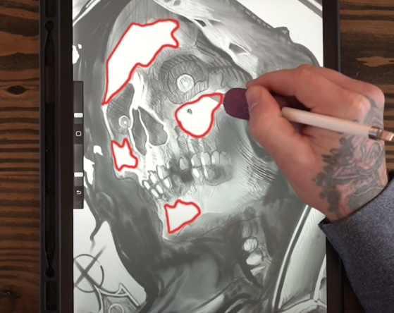
When creating tattoo designs for darker skin tones, it’s important to keep the design elements as simple and clear as possible. Since there isn’t as wide a range of values available, it becomes especially important to create light and shadow shapes separately.
To begin preparing your tattoo stencil, start by adding a layer above your main drawing or sketch. Then, use a bright white to fill in and simplify all the light shapes, creating sharp transitions between light and dark areas. The white acts as the “skin color” of the stencil, simplifying the stencil and eliminating unclear or blurry transitions that are hard to recognize while tattooing.
Contour lines to show how the tattoo will fit and flow

Next, create a lineart of the entire stencil, making sure to lightly outline and block in the shadow areas so you can see where the light ends and the shadow shapes begin.
Secondly, I like to use contour lines as a way to create a sort of topographical map of the tattoo. Incorporating these contour lines into the various shadow shapes makes it easier to accurately discern the direction and flow of the shadows.
These blocked-off transition areas and contour lines act as guideposts, helping with complex areas where light source and shape can get a little lost in darker skin tones.
Tattoo Stencil Visibility: Red vs Purple

The most common colors for stencils are red and purple, although purple paper is more commonly used. Unfortunately, when it dries it exhibits a greenish-gold sheen that can be hard to read on darker skin tones. This sheen isn’t as much of an issue on lighter skin tones, but on darker skin tones it blends in and makes the design hard to decipher.
Red stencil paper is the second option to consider. It tends to be lighter than the other options, but the visibility is clear and consistent. It’s the best because it doesn’t blur the contours and allows you to distinguish all the directional shapes in the shadows.
Bonus Tip: Block Shadows During Your First Tattoo Session
Finally, a little bit about the actual tattoo: always keep in mind how you are going to prepare for your next session. Sometimes a client can’t book multiple days in a row, or they may already have time booked for the next day, so make sure things are solidly finished before you finish.
Structuring the key light and shadow shapes will set you up for success. Consider adding a mid-tone gray or darker tone to act as a “primer” – this will show you where the shadows should go, which colors should go in which areas, etc. Doing this will not only ensure accuracy for your next tattoo, but it will also make it look more finished when your client leaves.
Additionally, consider leaving a hard outline until just before you finish your tattoo. This is the perfect opportunity to decide which parts of your design you want to emphasize. Think of a dark black outline as a finishing touch. This will further highlight those features, enhance the contrast, and draw attention to your focal points.
Want more education or resources about tattoos?
Check out our tattoo technique catalogue here!
You can see all the courses we offer here.
